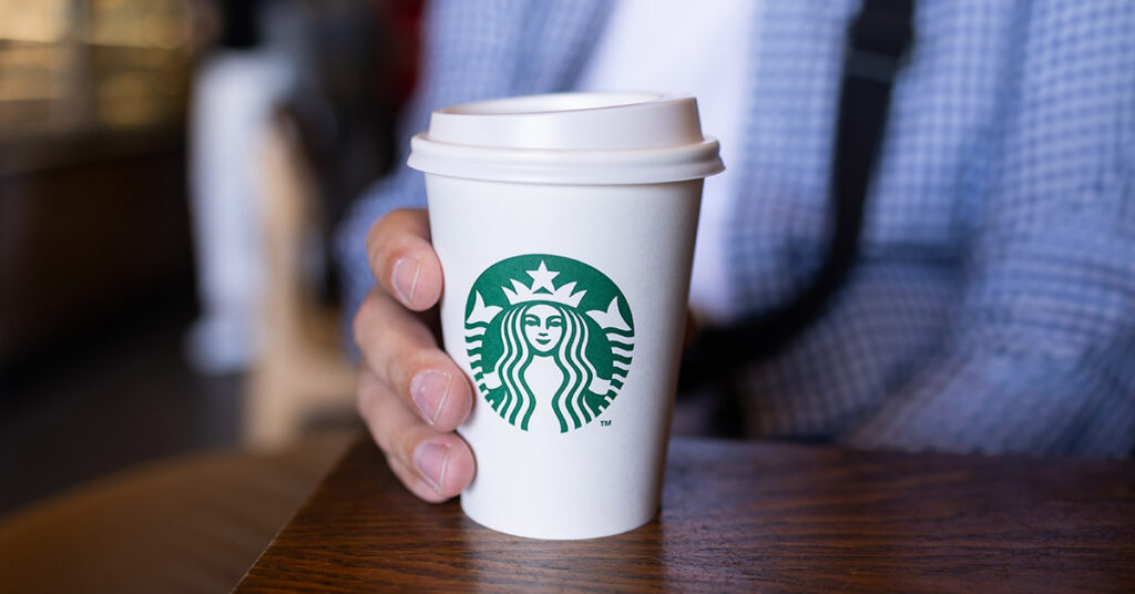
The Starbucks logo is one of the most recognizable emblems in the world, greeting millions of coffee lovers every day. But did you know that the iconic logo hides a subtle secret most people never notice? While the Siren’s face looks perfectly symmetrical at first glance, a closer inspection reveals a fascinating detail. Let’s dive into the story behind this hidden feature and why it makes the logo so unique.
The Starbucks logo has undergone several changes since the company’s founding in 1971. The original logo featured a brown color and a double-tailed mermaid, also known as a Siren, inspired by nautical themes and Herman Melville’s Moby Dick. In 1987, the color shifted to the now-familiar green, and by 1992, the logo was modernized as Starbucks became a public company.1 However, the most significant change came in 2011, when the words “Starbucks Coffee” were removed, and the Siren’s face became the sole focus of the logo.2
The Siren’s Symbolism
The Siren in the Starbucks logo is more than just a pretty face. Starbucks chose the Siren to symbolize the seductive allure of coffee, drawing customers in just like the Sirens of mythology lured sailors to their doom. But as Starbucks aimed to expand its offerings beyond coffee and reach new markets, they knew the Siren would need to evolve to better reflect the brand’s broader ambitions.3
The Imperfection
subtlety on a starbucks sleeve
Credit: Unsplash
When the global branding team at Lippincott set out to redesign the Starbucks logo in 2011, they wanted the Siren to represent confidence, allure, and approachability. Initially, they crafted a symmetrical, flawless version of the Siren’s face, but something felt off. “She was uncannily beautiful, a bit creepy, to be honest,” recalled creative director Connie Birdsall. The Siren’s perfect symmetry made her look unnatural, almost robotic.
The team realized that to make the Siren more relatable and human, they needed to introduce a small imperfection. “The imperfection was important to making her really successful as a mark,” Birdsall explained.
Read More: 7 of The Best Butter Brands You Can Spend Your Money On
The Hidden Asymmetry in the Logo
Credit: Pexels
Take a closer look at the Siren’s face. While it appears symmetrical at first glance, you’ll notice that one side of her face is slightly different from the other. Specifically, the right side of her face is shadowed more, and her nose dips a bit lower on that side. This subtle asymmetry adds a touch of humanity to her features, making the logo more inviting.
As design partner Bogdan Geana pointed out, “It felt a bit more human and felt less like a perfectly cut mask” after adding the asymmetry. This small but impactful detail transformed the Siren from a flawless figure into a relatable symbol for millions of coffee drinkers worldwide.
Why Asymmetry Works
Starbucks sign hanging
Credit: Unsplash
The decision to make the face on the Starbucks logo asymmetrical goes against the conventional wisdom that beauty is found in symmetry. However, the Starbucks team realized that too much perfection could make the Siren appear cold and distant. By adding a slight asymmetry, they gave her a more approachable and friendly quality. This was a critical step in ensuring that customers felt a deeper connection with the brand.
The Siren’s Role Beyond Coffee
How the Siren face has changed over the years
Credit: Lippincott
In the same redesign, Starbucks chose to remove the words “Starbucks Coffee” from the logo. By this point, the Siren had become so recognizable that the company no longer needed text to communicate the brand. This allowed Starbucks to branch out beyond coffee and expand its offerings, which now include everything from breakfast foods to evening snacks and beverages like wine.
The Subtlety Behind the Starbucks Logo
The Starbucks Logo today
Credit: Getty Images
The next time you hold a cup of Starbucks coffee, take a moment to look closely at the Siren. Her subtle asymmetry is a reminder that imperfection can make things more relatable, human, and approachable. This hidden detail in the Starbucks logo isn’t just a design quirk—it’s a testament to the power of thoughtful branding.